If “Honesty” is the goal of all art, it’s pure hypocrisy that our main vehicle is color. Color is only seen as influenced by the color in its surroundings.
In visual perception a color is almost never seen as it really is – as it physically is. This fact makes color the most relative medium in art.
– Josef Albers
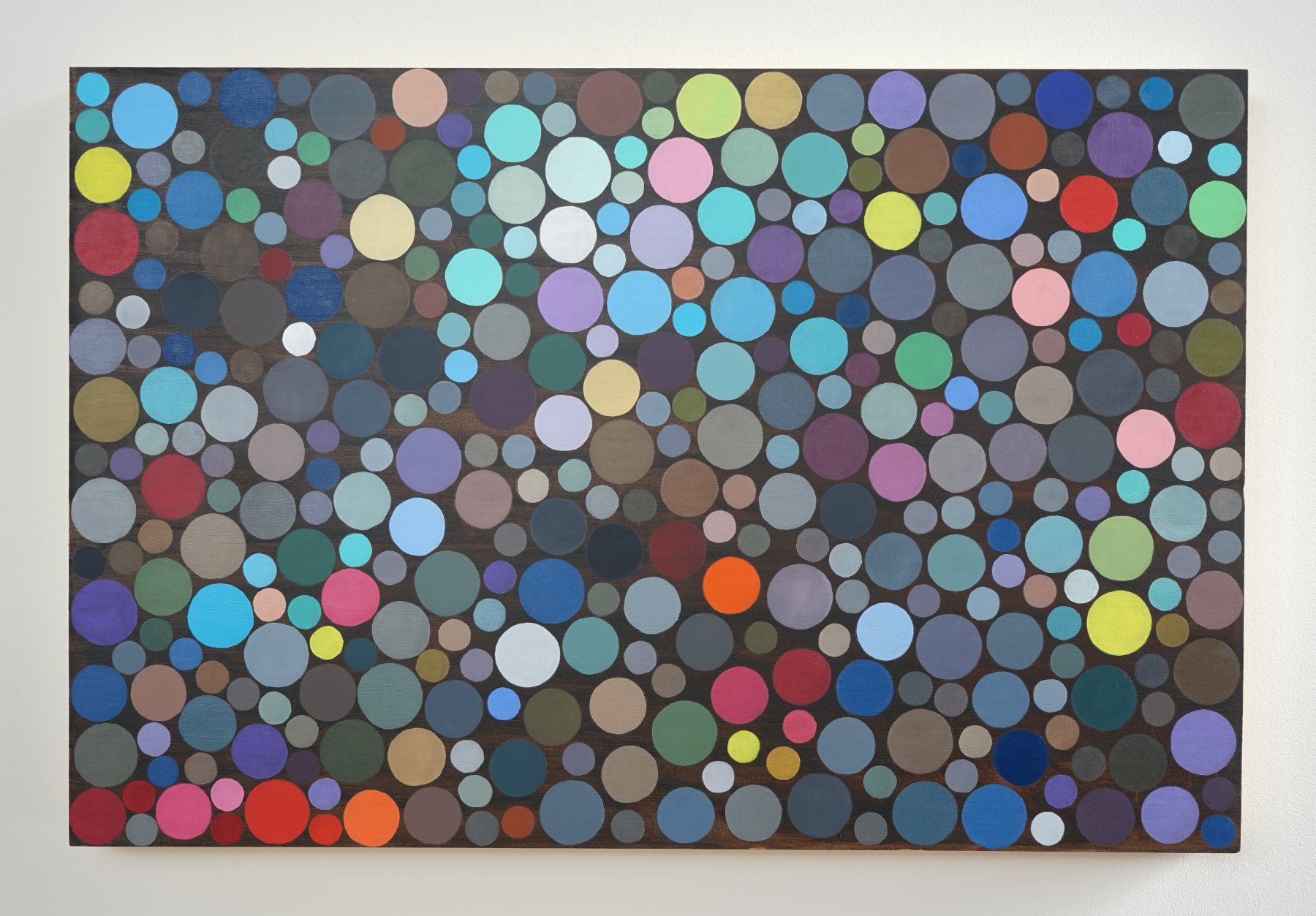
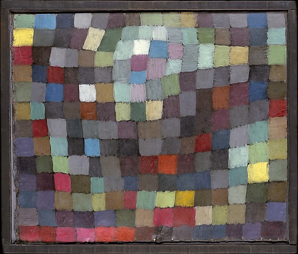
My fascination with the interaction of color has propelled this ongoing series of dot paintings. “Circles 5” is at its heart an attempt to expound on the effects of the interaction of color on a larger scale. The design of the piece came from Paul Klee’s “May Picture,” 1925; part of his “Magic Squares” series. The fluid beauty of this work is achieved both in the interaction of colors as well as the size/shape of each block. Multiple focal points have been created through the juxtaposition of cold and warm colors, light, dark and saturation.
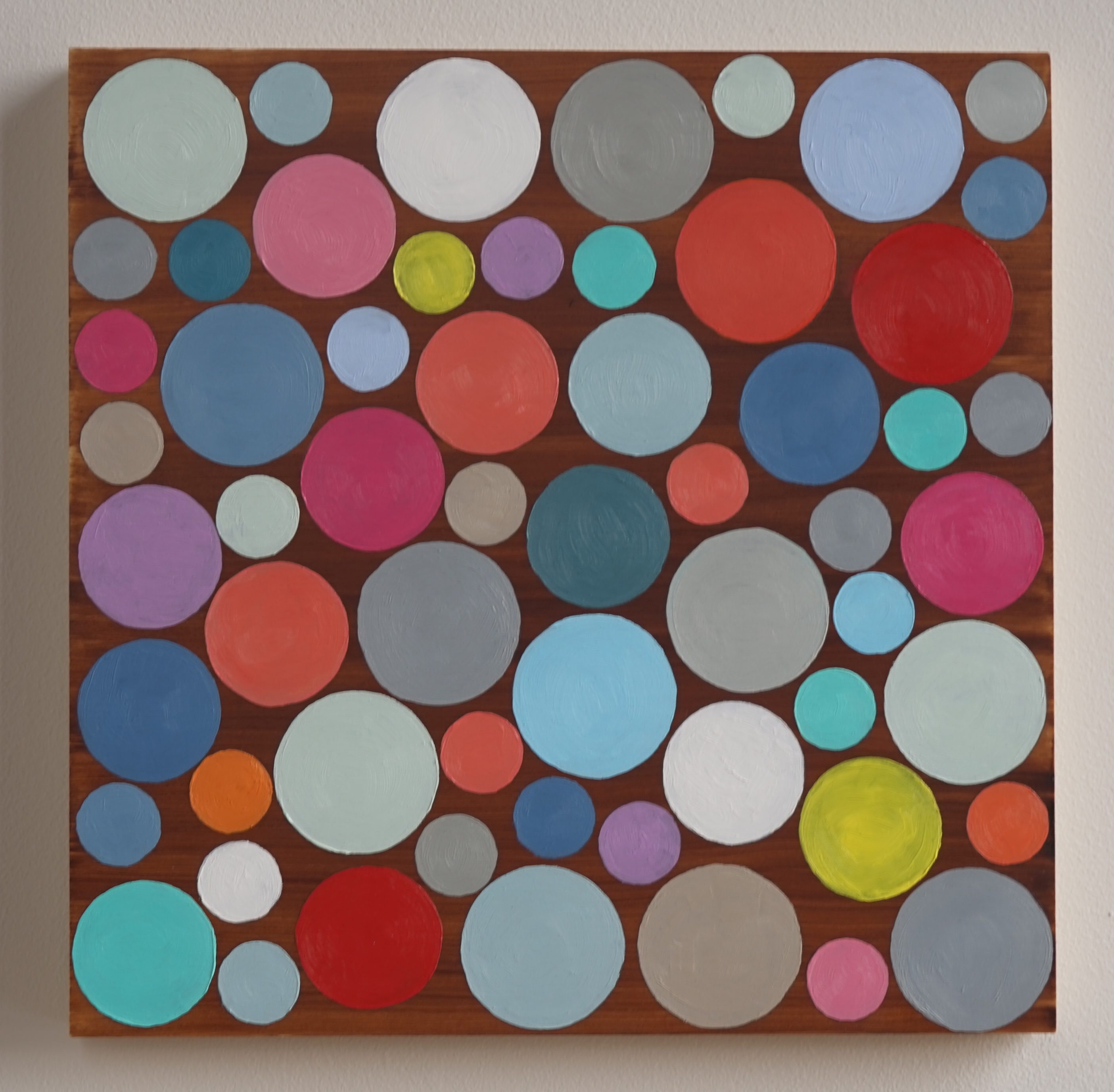
Klee wrote, “whether we like it or not, our eyes gobble squares, circles, and all manner of fabricated forms.” While Klee used squares, rectangles and triangles, few of his works used circles. Stealing from this “Magic Square” formula, my first study, “Circles 3,” was created in mid 2015. The work is oil on birch board, 12″ x 12″ using a simple burnt umber wash as the background.
The analogy of musical composition can not be ignored in the creation. Like color, a musical note rings pure and is then influenced by the surrounding notes. A notes pitch and volume are then manipulated for a desired effect. Approaching these visual works under that “symphonic” mindset is a major goal and preoccupation as the colors are mixed and laid next to each other. Looking at Klee’s piece you can clearly see his simple use of light squares that move toward the viewer and use of darker grays, greens, purples and even blacks that recede. In order to create further harmony, complimentary colors are rarely placed next to each other and when they are, are matched in saturation.
While “Circles 3″ was successful in the use of grays, the size limitations on 12″ x 12” did not allow for the full use of greens and additional earth tones. “Circles 5″ was created using a 36″ x 24” cradled birch board. The surface was oil primed then covered with a thin wash of burnt umber. The background was created using a turpentine diluted Van Dyke Brown. Focal points are added first then darker colors are placed. I created the time lapse video below form stills. Unfortunately I started documenting the piece about a quarter way into the painting.